
You need video and audio guidelines to ensure consistency, clarity, and professionalism across all content. They help maintain your brand’s tone, visual identity, and sound quality—whether you're producing a promo video, podcast, or social media reel. These guidelines ensure that lighting, framing, color grading, voiceover tone, and music style all align with your message, making your content recognizable, accessible, and emotionally cohesive.
An audiovisual concept is the central idea or creative axis that gives shape and coherence to an audiovisual production (such as a video, commercial, documentary, short film, etc.). This concept defines what you want to communicate, how the story will be told, and with what visual and sound style the message will be conveyed.
It’s like the “heart” of the project: a mix of message, emotion, aesthetics, and narrative that guides all creative and technical decisions (script, camera work, music, pacing, etc.).
Product: Artisanal coffee.
Audiovisual Concept: “Back to nature.”
How is it translated? You would use shots of landscapes, nature sounds, close-ups of coffee beans, soft music, and a narrative that highlights authenticity and handcrafted quality.
All elements (images, music, text, etc.) align with the same style and message.
A clear concept connects better with the audience and evokes feelings and emotions.
Helps the team (writers, editors, camera operators, etc.) make clearer, unified creative decisions.
A solid concept makes the content more memorable and recognizable.
It allows you to stand out and communicate unique values or styles.
If you have some ideas for the video concept, like movies, series or video promo, it's necessary to bring these examples to the meeting so we can start working on the production of the video.
A fast-paced video with vibrant colors and intense music that conveys enthusiasm and vitality.
A visually active style with lots of camera movement and quick cuts that create a sense of action or constant change.
Uses muted tones, soft or sad music, and a slow pace to evoke nostalgia or sadness.
An introspective, calm, and emotional style that invites the audience to think or deeply connect with the message.
Is there a movie you like? Does any promo video catch your attention?
Color grading is the process of adjusting and stylizing the colors in a video to achieve a specific visual aesthetic or enhance the mood of a scene. Its benefits include improving storytelling, unifying the visual style, and creating a more substantial emotional impact on the viewer.

This style aims to keep colors as true to reality as possible, with balanced tones and a clean look. It’s ideal for documentaries, interviews, or videos that require an authentic and realistic representation.

Uses bluish and desaturated tones to create a distant, tense, or melancholic atmosphere.Commonly used in thrillers, dramas, or scenes that convey loneliness or emotional coldness. It can also be used for happy and positive moments and emotions.
Applies yellow, orange, and reddish tones that evoke warmth, closeness, and positive emotions. Typically used in commercials, romantic or nostalgic scenes, and cozy environments.
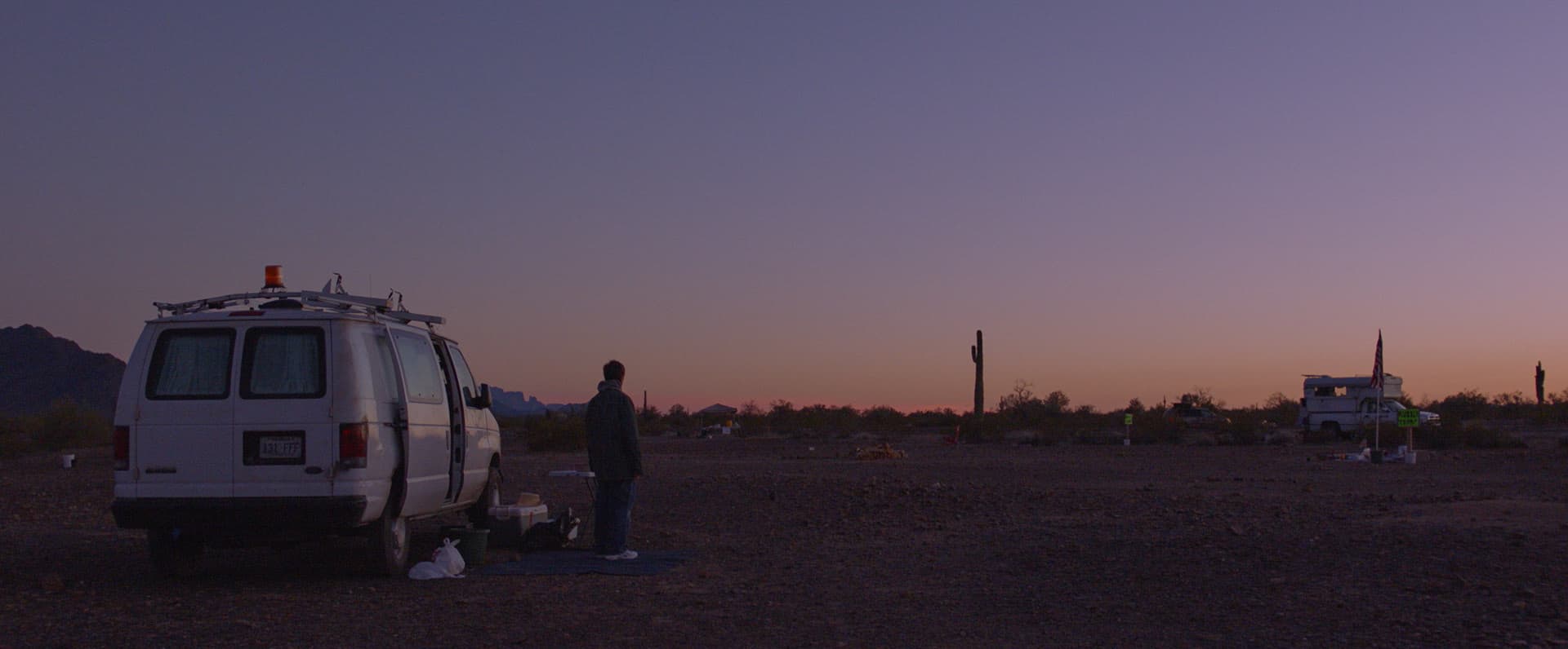
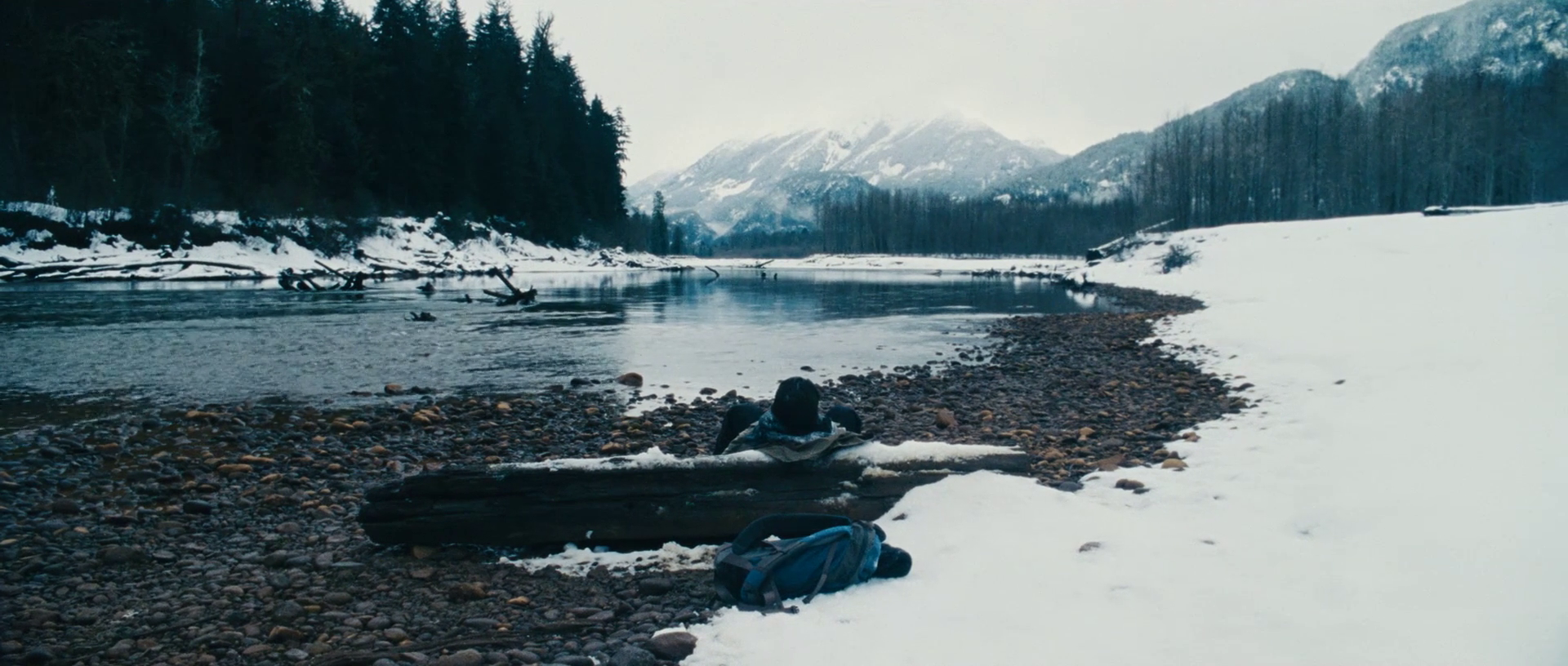
Nomadland’s color grading aims for a natural and realistic style, almost documentary. It uses earthy tones, muted skies, and soft lighting, taking advantage of natural light (especially during sunrise and sunset) to convey solitude, freedom, and connection with the landscape.There are no intense colors or striking filters. The grading supports the intimate and contemplative tone of the story, highlighting the simple beauty of the nomadic life.In summary: the color in Nomadland feels authentic and understated, reinforcing the sense of real life lived calmly.
Nomadland (2020, dir. Chloé Zhao)
Color Style: Naturalistic, soft, and subtle.
Palette: Earth tones, desaturated blue skies, warm tones at sunset.
Mood: Realism, melancholy, connection with nature.
Use of Color: No intense colors or flashy filters. The grading respects natural light, especially the “golden hour,” conveying intimacy and solitude without visual exaggeration.
It’s a great example of how color can be almost invisible yet deeply emotional and cinematic.

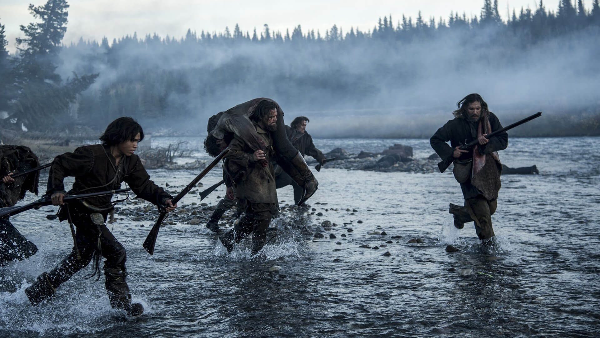
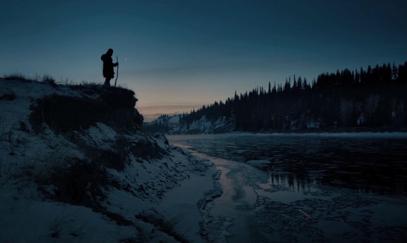
The Revenant’s color grading is grounded in realism, brutality, and the harshness of nature. It uses a cold, desaturated palette, dominated by blues, grays, whites, and muted earth tones, which intensify the sense of isolation and the protagonist’s suffering. From the very beginning, the film establishes a raw and wintry atmosphere. There is no visual warmth: the cold colors follow the narrative of survival, pain, and revenge. Additionally, the use of natural light with no artificial filters enhances the authenticity and harshness of the environment. As the character confronts the wild and indifferent landscape, the cold grading amplifies the hostility of the world and the fragility of man. Even the daytime scenes are wrapped in mist and icy tones, while nighttime scenes emphasize emptiness and solitude with deep blues and desaturated blacks.
The Revenant (Dir. Alejandro G. Iñárritu)Style: Realistic, raw, naturalistic.
Palette: Dirty whites, cold blues, grays, muted greens, desaturated browns.
Mood: Hostility, loneliness, suffering, survival.
Technique: Shot entirely with natural light (no artificial lighting), cold digital grading, low saturation.
Narrative function: The color reflects the harshness of the environment, the character’s isolation, and the brutal tone of the story. Every frame communicates both physical and emotional coldness.
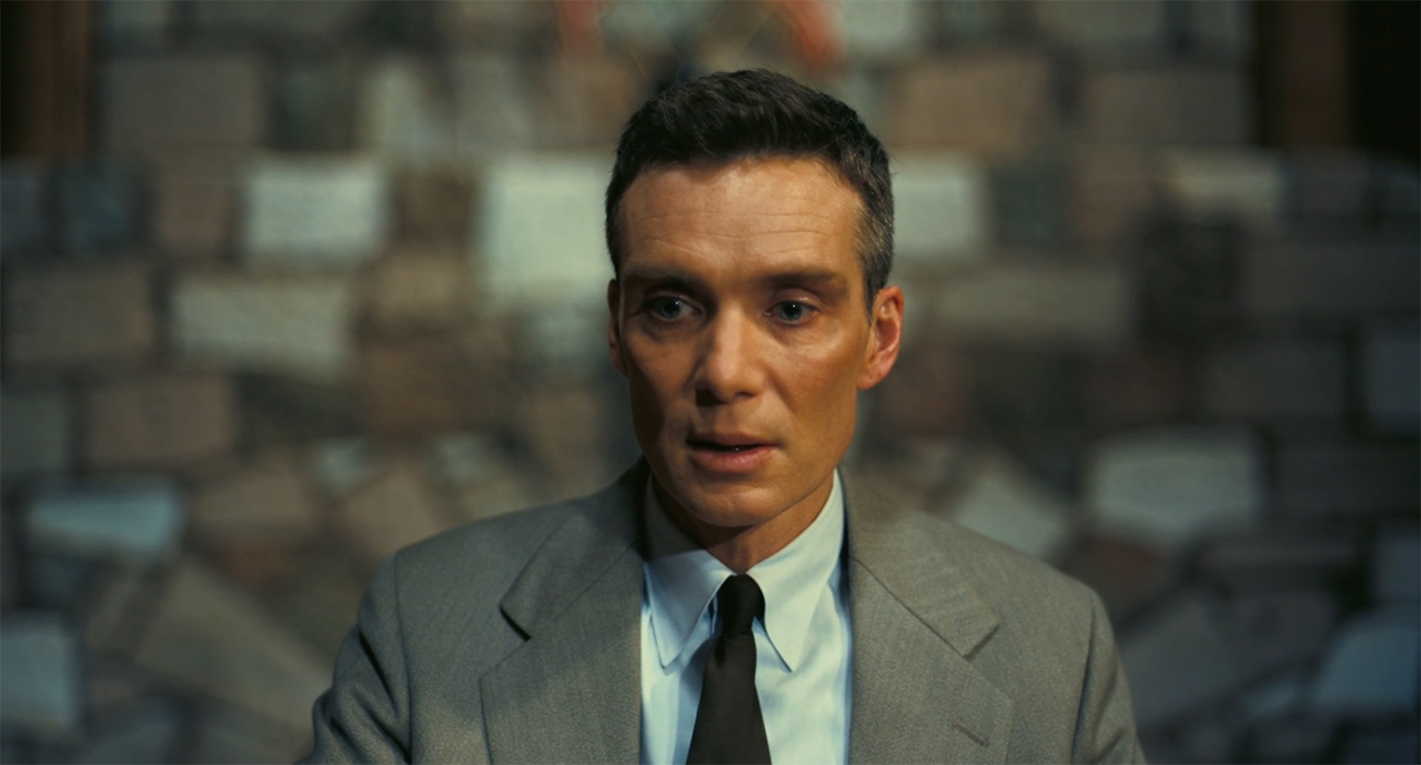
Oppenheimer's color grading is characterized by a naturalistic, contrasted, and dual style, with two main palettes:
Color:
Represents Oppenheimer’s subjective perspective. It uses warm, earthy, and orange tones, with soft lighting that evokes introspection, emotional tension, and latent nuclear energy.
Palettes:
Black and white: Objective, documentary perspective.
Color: Warm, earthy, muted tones.
Mood: Realism, gravity, introspection, historical tension.Technique: Shot in IMAX using physical film (both color and B/W).
The overall grading avoids saturated colors, maintaining a serious and dramatic atmosphere in line with the weight of the subject matter (the creation of the atomic bomb).
Oppenheimer: Color grading in service of historical and psychological drama.

A soundtrack is the complete audio track of an audiovisual production, including all music, sound effects, and dialogue featured in the project.It can refer to both the original music created for the production and the selected songs that accompany the scenes.Why is it important?Sound and music are essential because they enhance the atmosphere and emotions of a production, making the message more impactful and memorable. They also guide the viewer’s attention and subtly but powerfully reinforce the narrative.
Sound and music are essential because they enhance the atmosphere and emotions of a production, making the message more impactful and memorable. They also guide the viewer’s attention and subtly but powerfully reinforce the narrative.
There are various soundtrack styles depending on the type of production and the effect you want to achieve. Here are some common ones:


Here are some popular platforms where you can publish a video, depending on the type of content and the audience you want to reach:


A branding guide ensures consistency in visuals and messaging across all platforms. It provides clear rules for logos, colors, typography, and tone. Helping teams stay aligned, build trust, and create a unified, recognizable brand experience.
Get Started